


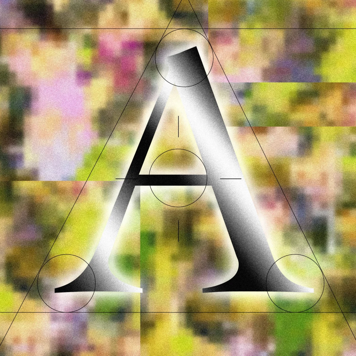
As the global expansion of generative artificial intelligence reaches a point of saturation, a distinct aesthetic shift is occurring within the industry’s branding and user interface design. For the past decade, the technology sector was defined by "blanding"—a term used to describe the move toward minimalist, geometric sans-serif typefaces such as Helvetica, Arial, and custom-built fonts like Google’s Product Sans. However, a new trend is emerging among AI-native companies: a return to the serif. This movement, characterized by the use of fonts with decorative "feet" or strokes at the ends of letters, has been dubbed the "Serif Renaissance" by design practitioners. While intended to project warmth, scholarship, and human touch, the trend has also birthed a more cynical critique known as "tasteslop"—the use of superficially sophisticated design to mask the cold, algorithmic nature of the underlying technology.
The Shift from Digital Minimalism to Humanistic Design
The transition toward serif typefaces represents a strategic departure from the aesthetic of the "SaaS era" (Software as a Service), which favored clean, sterile, and hyper-efficient visual identities. Companies like Anthropic, Perplexity, and Runway have increasingly integrated serifs into their branding and chat interfaces. Keya Vadgama, a San Francisco-based writer, designer, and type practitioner who first popularized the term "Serif Renaissance," suggests that this is a deliberate effort to humanize a technology that is inherently impersonal.
"AI is inherently cold and without opinion," Vadgama noted in a recent analysis. "Using serifs signals, ‘We’re AI! But real humans use (and made) our product!’ It is a bid for personality and warmth in an era where users are becoming increasingly skeptical of automated outputs."
The use of serifs is not merely a stylistic choice but a psychological one. Serifs have their origins in calligraphy and the physical act of carving or writing, which connotes a fluid, human way of making letterforms. By adopting these styles, AI companies are attempting to build a bridge of trust between their software and the user, positioning their models not as "machines" but as "collaborators" or "scholars."
A Chronology of Tech Typography
To understand the Serif Renaissance, one must look at the evolution of computer-based typography over the last half-century.
- The Terminal Era (1970s–1980s): Early computing was defined by technical limitations. Monospaced, blocky fonts like those used in IBM terminals were designed for legibility on low-resolution screens. These fonts were fluorescent, harsh, and synonymous with the "unfriendly" machine.
- The Desktop Publishing Revolution (1990s): The introduction of the Apple Macintosh and the democratization of fonts like Times New Roman and Garamond brought traditional print aesthetics to the screen. However, low screen resolution often made serifs appear jagged and difficult to read.
- The "Blanding" Era (2010s): As high-resolution "Retina" displays became standard, tech giants pivoted toward "blanding." Brands like Airbnb, Google, and Spotify dropped their unique, quirky logos in favor of nearly identical, bold sans-serifs. This aesthetic signaled efficiency, modernity, and a "frictionless" user experience.
- The Serif Renaissance (2023–Present): With the rise of Large Language Models (LLMs), the "frictionless" look began to feel corporate and untrustworthy. AI companies began reaching back to the 18th and 19th-century aesthetics of the printing press to evoke authority and wisdom.
Supporting Data and Psychological Implications
Research into typographic psychology suggests that font choice significantly impacts how information is perceived. A study published in the journal Psychology of Popular Media Culture indicates that serif fonts are frequently associated with "formality," "reliability," and "academic rigor." Conversely, sans-serif fonts are viewed as "modern," "objective," and "innovative."
For AI companies, the "reliability" and "academic" associations of serifs are vital. Because LLMs are prone to "hallucinations"—generating false information with high confidence—the branding must work overtime to project an image of scholarly accuracy.
Anthropic’s Claude, for instance, defaults to a serif font set against a slightly off-white, parchment-colored background. This design choice is not accidental; it mirrors the experience of reading a physical book. Ali S. Qadeer, chair of graphic design at the Ontario College of Art and Design in Toronto, notes that this "vibe-coding" is a direct response to social criticism. "The sterile look of tech that has dominated for the past 20 years has increasingly negative connotations," Qadeer explains. "Print has deeper associations with trust."
Official Responses and Industry Perspectives
The move toward human-centric design is being defended by industry leaders as a natural evolution of the user experience. Jesse Dwyer, Chief Communications Officer at Perplexity, an AI-powered search engine that utilizes serif-heavy branding, told journalists: "Why wouldn’t we have human design? Perplexity is for people."
This sentiment is echoed by some designers who view the shift as pragmatic rather than manipulative. Yitong Zhang, a designer and founder, suggests that AI labs are simply maturing in their aesthetic tastes. He compares the current state of AI branding to a teenager experimenting with different styles to find an identity. Zhang likens the current "sophisticated" look to the concept of "premium mediocre"—a term coined by blogger Venkatesh Rao to describe a kind of faux-luxury that is accessible to the masses. Like the "finest bottle of wine at an Olive Garden," serif fonts provide a veneer of high culture to a mass-produced digital product.
However, the critique of "tasteslop" remains a significant counter-narrative. The term, circulating in design circles on platforms like X (formerly Twitter), describes the phenomenon where AI-generated or AI-adjacent designs appear superficially beautiful but lack genuine artistic intent or structural integrity. Critics argue that if every AI startup adopts the same "distinguished" serif look, the aesthetic will eventually become as stale and "generic" as the sans-serif blanding that preceded it.
The Broader Impact and Political Parallels
The rejection of modern, computerized fonts is not limited to the tech industry. In a surprising parallel, the United States Department of State recently announced a return to Times New Roman for official documentation. This move came after Secretary of State Marco Rubio criticized the use of Calibri—a sans-serif font that had been the department standard since the Biden administration—as being "informal" and "unprofessional."
The political pivot back to the serif suggests a broader cultural desire for a return to traditionalism and perceived authority. In both government and technology, the serif is being used as a tool to reclaim a sense of "seriousness" in an era defined by digital volatility.
Analysis of Implications for the Future of AI
The Serif Renaissance highlights a fundamental tension in the AI industry: the "Identity Crisis." AI companies are selling the most advanced technology in human history, yet they are increasingly wrapping it in the visual language of the 1930s.
There are three primary implications of this trend:
- The Dilution of Authority: As more "slop" (low-quality AI content) is presented in high-quality serif fonts, the historical association between serifs and "truth" may erode. If a user reads a hallucination in a font that looks like the Encyclopaedia Britannica, they may eventually stop trusting the font itself.
- The Rise of Counter-Aesthetics: As serifs become the new corporate standard for AI, we may see a "post-AI" design movement that embraces intentional "glitch" aesthetics or brutalist designs to signal that a product is actually human-made and not trying to hide its digital nature.
- Self-Replicating Design: Since AI models are increasingly trained on data and designs produced by other AI models, the preference for serifs could become a self-fulfilling prophecy. If an AI "thinks" a sophisticated design includes a serif, it will generate more serif-based designs, leading to an aesthetic feedback loop.
Ultimately, the shift to serifs is an admission by the tech industry that "cool and computerized" is no longer a selling point. In the quest for mass adoption, AI must look less like a silicon chip and more like a library. Whether this transition represents a genuine move toward human-centric design or is merely a sophisticated "feint" remains a subject of intense debate among designers and users alike. As Keya Vadgama concludes, "You can use Comic Sans if you wanted; it doesn’t stop you from still being an AI company." The font may change, but the underlying challenge of building true trust in artificial intelligence remains.