


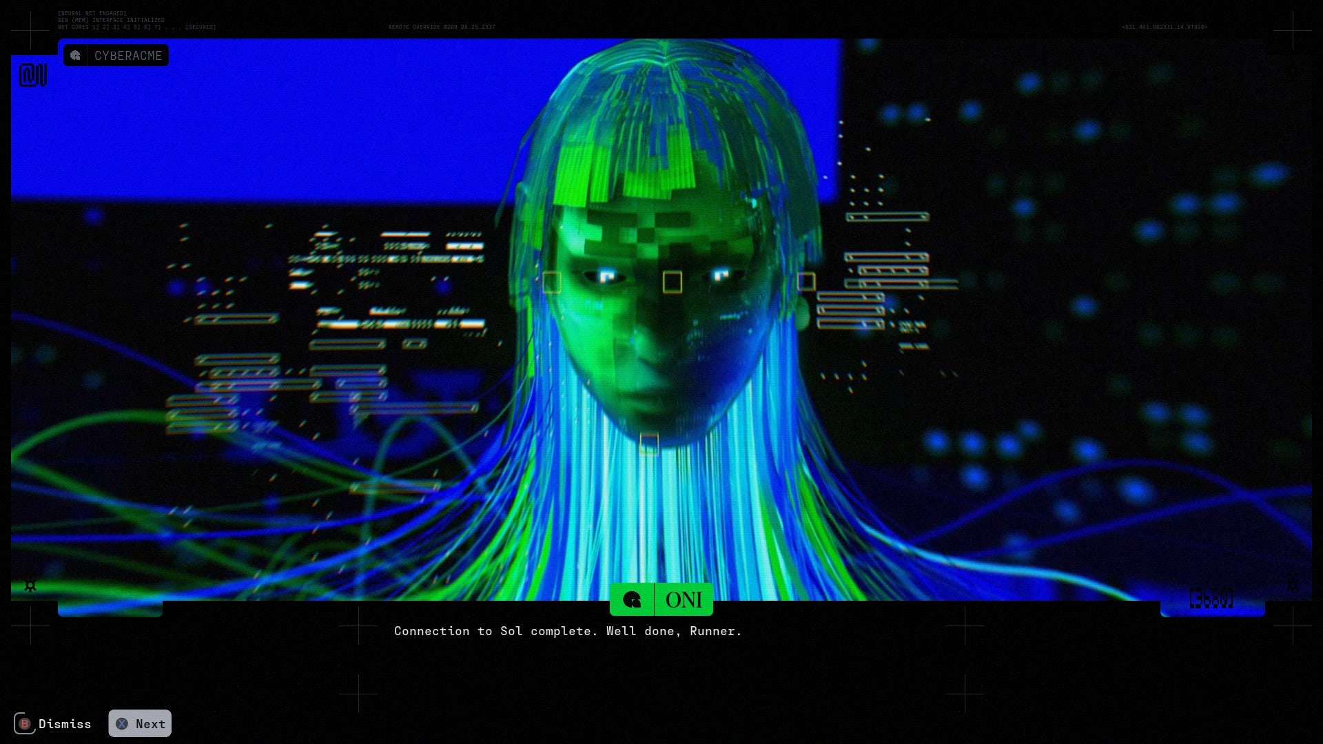
The upcoming revival of Marathon by Bungie represents a significant departure from the studio’s recent history with the Destiny franchise, pivoting toward the competitive extraction shooter genre while establishing a visual identity that challenges contemporary science fiction norms. Originally a seminal first-person shooter series for the Macintosh in the 1990s, the new iteration of Marathon eschews the gritty, battle-worn aesthetics common in the genre in favor of a "maximum minimalist" approach. This aesthetic strategy layers high-contrast color palettes, industrial logistics motifs, and surrealist digital art to create a world that is both hyper-modern and hauntingly nostalgic. As the project progresses through its development cycle, the game’s art direction has become a central pillar of its identity, serving as both a gameplay tool and a narrative vessel for a world defined by fathomless manufacturing and cosmic bureaucracy.
The Antireal Controversy and Professional Resolution
A defining moment in the development of Marathon’s visual identity occurred during its early public reveals. The game’s aesthetic, characterized by retro-futuristic CGI elements and intricate graphic design, was found to have incorporated unauthorized elements from independent artist Fern Hook, known professionally as Antireal. The artist identified specific visual assets within the game’s promotional material and early builds that mirrored their signature style without prior licensing or acknowledgment.
Bungie’s response to the plagiarism allegations was uncharacteristically transparent for a major AAA studio. Following an internal investigation, the company admitted fault, acknowledging that the work of Hook had been utilized without proper authorization. Rather than merely removing the assets and issuing a formal apology, Bungie opted for a collaborative resolution. Fern Hook was officially brought onto the project as a "visual design consultant," ensuring that her aesthetic influence was integrated ethically and that her contributions were properly credited. This resolution not only mitigated a potential public relations crisis but also solidified the game’s commitment to a specific, avant-garde art style that merges 1990s digital art traditions with modern rendering techniques.
A Chronology of the Marathon Franchise
To understand the weight of the new Marathon’s art direction, one must look at the franchise’s historical trajectory. The original Marathon, released in 1994, was a pioneer in narrative-driven shooters, featuring complex lore delivered through computer terminals and a sophisticated physics engine for its time.
- 1994–1996: The original trilogy (Marathon, Marathon 2: Durandal, and Marathon Infinity) establishes Bungie as a premier developer, introducing themes of rampant artificial intelligence and transhumanism.
- 2001–2022: Bungie moves on to create Halo and later Destiny, leaving the Marathon IP dormant for over two decades, though thematic echoes remain present in their subsequent works.
- May 2023: During the PlayStation Showcase, Bungie officially announces the Marathon reboot with a high-concept CGI trailer that introduces the "Runner" protagonists and the vibrant, graphic-heavy art style.
- 2024: Following leadership changes and internal delays, Bungie reinforces its commitment to the project, integrating feedback from professional artists and community playtesters to refine the extraction shooter loop and its visual clarity.
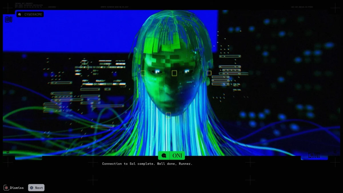
The Aesthetic Framework: Maximum Minimalism
The visual language of Marathon is heavily influenced by "The Designers Republic" (TDR), a graphic design studio known for its work with electronic musicians like Aphex Twin and the iconic visual identity of the Wipeout racing series. This "maximum minimalist" style is characterized by an abundance of information—logos, barcodes, serial numbers, and icons—presented with clinical precision.
In Marathon, this manifests as a world "dressed in layers." The foundational layer consists of stark, naturalistic environments. Many of the game’s maps feature obsidian-like rock formations and desolate, blasted plains reminiscent of Icelandic volcanic landscapes. This naturalism provides a grounded stage for the more surreal human elements superimposed upon it.
The second layer is defined by industrial infrastructure. Unlike the rusted, "used future" aesthetic of Star Wars or Alien, Marathon’s human structures resemble the clean, modular components of the modern global supply chain. Players navigate environments filled with ersatz warehouses, loading docks, and specialized vehicles that evoke the atmosphere of a high-tech airport or an automated fulfillment center. The geometry is dominated by flat-pack buildings and gantries, suggesting a world where colonization is a matter of rapid, mass-produced logistics.
Consumerist Motifs and the Bureaucracy of Space
Perhaps the most jarring and distinctive element of Marathon’s art style is its use of color and packaging design. The game utilizes a palette of high-visibility pinks, cyans, yellows, and oranges, often applied to structures that resemble consumer products rather than military installations.
Design analysts have noted that several in-game objects, such as two-story-tall orange canisters and rounded modular buildings, share a visual DNA with modern skincare branding—specifically brands like Byoma or Drunk Elephant. These designs favor thick plastic textures, injection-molded curves, and a "toy-like" cleanliness that contrasts sharply with the violent nature of an extraction shooter.

This theme extends to the game’s "visual detritus." Surfaces are covered in:
- Print Registration Marks: Symbols typically found on the margins of magazines or cereal boxes.
- Fiducial Markers: Cross-shaped markers used in Apollo mission photography to assist in photogrammetric measurements.
- QR Codes and Digital Glitches: UI elements that invoke the aesthetic of late 90s "Geocities" web design and Tetra-pak opening instructions.
These elements suggest a "bureaucracy of the cosmos," where every object is tracked, scanned, and cataloged by an unseen corporate or artificial intelligence. The presence of these markers reinforces the game’s central conceit: players are "Runners" operating within a hyper-industrialized, post-human wasteland where data and logistics are the only remaining currencies.
Technical Implications and Genre Positioning
The decision to lean into such a bold visual style serves a functional purpose within the extraction shooter genre. In games like Escape from Tarkov or Hunt: Showdown, visual camouflage and muted tones are essential for survival. Marathon, conversely, appears to embrace high visibility. This choice suggests a faster-paced gameplay loop where player movement and environmental interaction are prioritized over traditional stealth.
Data from recent industry trends indicates that "vibe-focused" shooters are gaining traction as the market for traditional military simulators becomes oversaturated. By focusing on a "mood board" that includes Demoscene traditions, "The Backrooms" internet aesthetic, and 1970s futurism, Bungie is positioning Marathon as a premium, stylized alternative to its competitors.
The integration of "micro-layers of weirdness"—such as hallways resembling waterpark slides or terminals that look like 1970s mainframe computers—serves to keep the player in a state of perpetual curiosity. This "visual intoxication" is intended to drive the "one more round" mentality essential for the success of live-service titles.

Broader Industry Impact and Ethical Artistry
The evolution of Marathon’s art direction also highlights a growing trend in the gaming industry: the formalization of "internet aesthetics" into AAA production. By incorporating elements of vaporwave, brutalism, and industrial design, Bungie is bridging the gap between niche digital art communities and mainstream entertainment.
Furthermore, the resolution of the Fern Hook controversy sets a potential precedent for how major studios interact with independent creators. As AI-generated art and digital asset scraping become more prevalent, the ethical sourcing of visual inspiration is a critical concern. Bungie’s decision to credit and hire the artist whose style they emulated provides a blueprint for "restorative" art direction, where the original creators are given a seat at the table rather than being sidelined by corporate legal teams.
As Marathon moves toward its eventual release, its success will likely be measured not just by its gunplay or server stability, but by its ability to maintain the coherence of its eclectic visual world. It remains a rare example of a high-budget project that treats art style as a primary mechanic, inviting players to scavenge not just for weapons and gear, but for the very aesthetic details that define its strange, fathomless universe.